

Concept & Direction
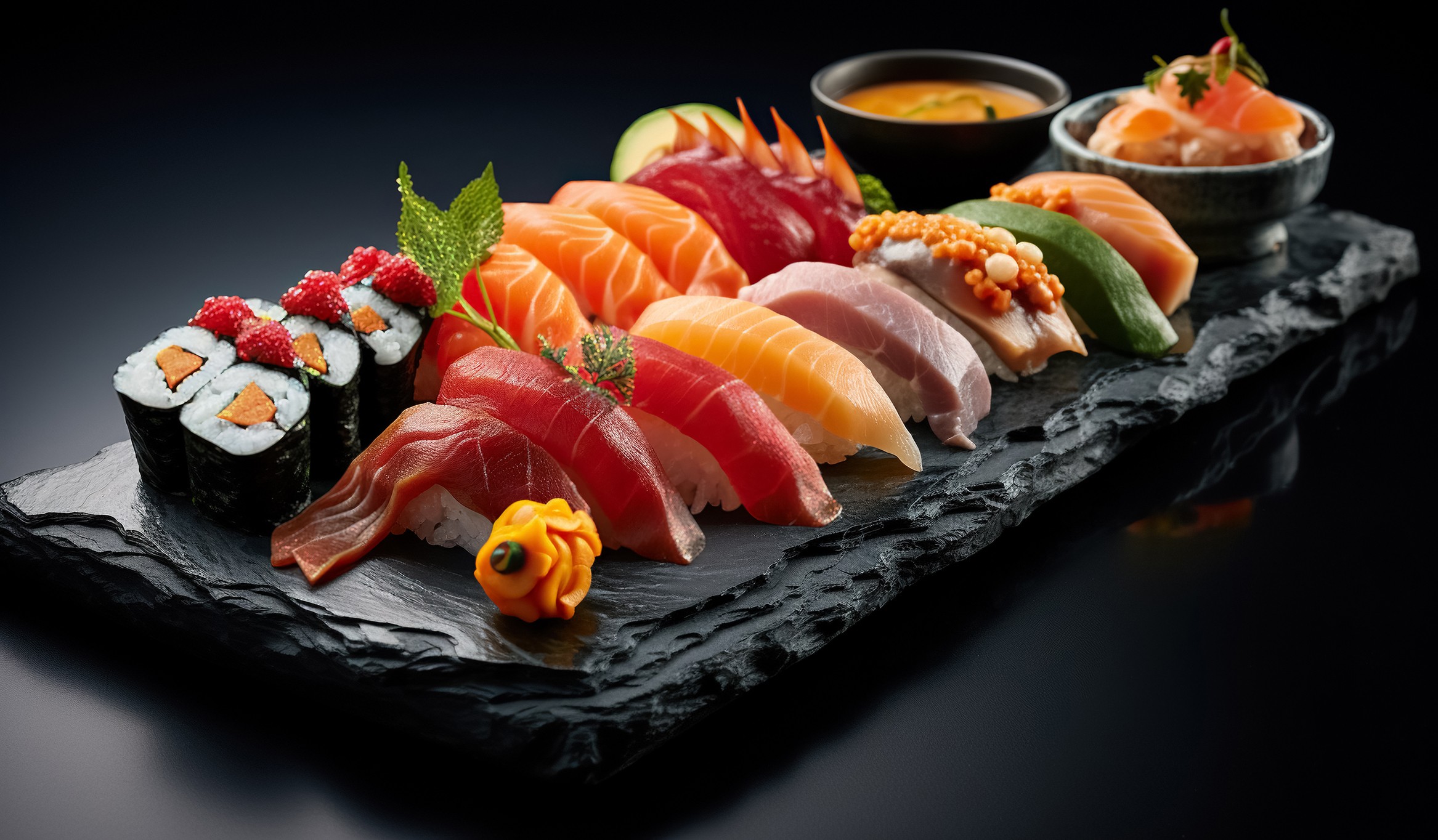
The visual system is inspired by the elegance of sushi-making, clean cuts, balance, and flow combined with dynamic compositions to reflect freshness and movement. High-contrast photography, deep black backgrounds, and vibrant salmon tones are used to highlight the hero ingredient and create a strong visual appetite appeal.
SA-SHI-MON
Visual Identity
Logo System: Minimal geometric forms inspired by salmon texture and sushi cuts, designed to be flexible across physical and digital touchpoint
Color Palette: Deep black for sophistication, paired with rich orange and warm tones to emphasize freshness and flavor
Typography: Clean, modern type to balance the expressive visuals and ensure readability across signage and marketing materials
SA-SHI-MON
A contemporary sushi restaurant brand that celebrates the craftsmanship of Japanese cuisine through a bold, modern visual identity.
The branding concept focuses on premium ingredients, precision, and sensory experience, positioning SA-SHI-MON as an artisan sushi destination rather than a casual takeaway brand.
Role:
Branding Designer
Year: 2025
Timeline: 2 weeks
Tools:
Illustrator
Photoshop

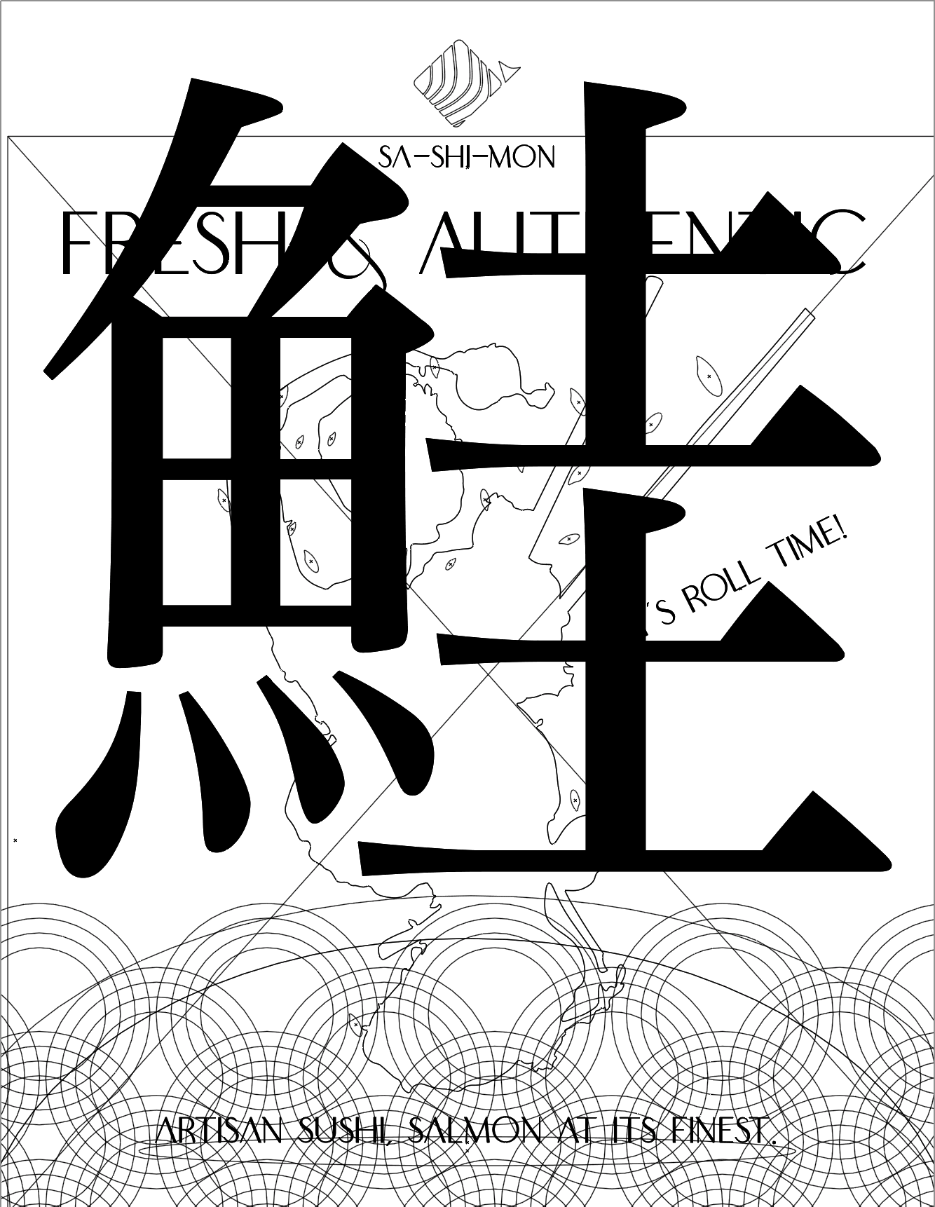

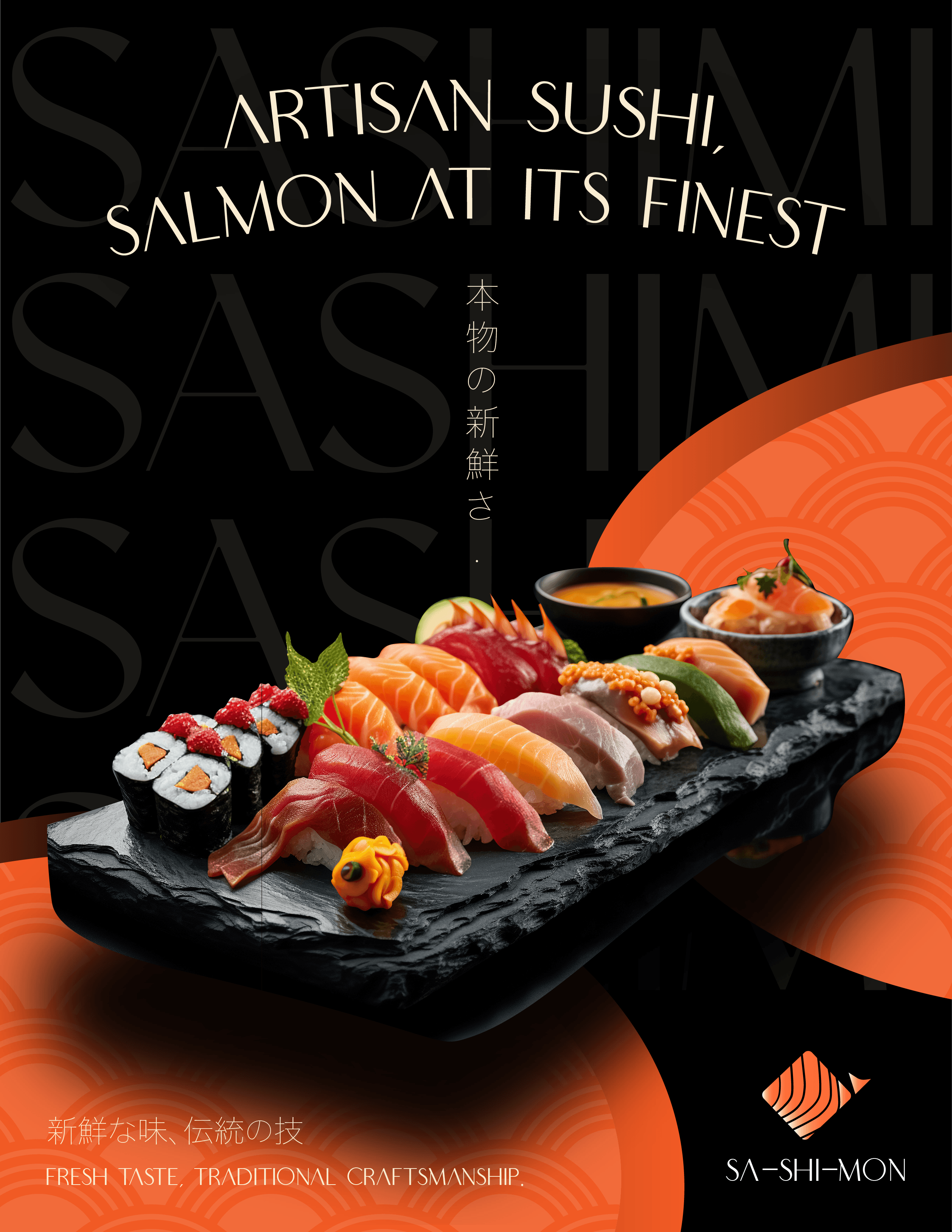
The layout uses strong visual hierarchy, with the oversized Japanese character “鮭” (salmon) as the primary focal point to create depth and reinforce the brand identity. High contrast between the dark background and vibrant food imagery enhances readability and visual impact. Clean typography, grid alignment, and layered composition help balance traditional Japanese elements with a modern, premium aesthetic.
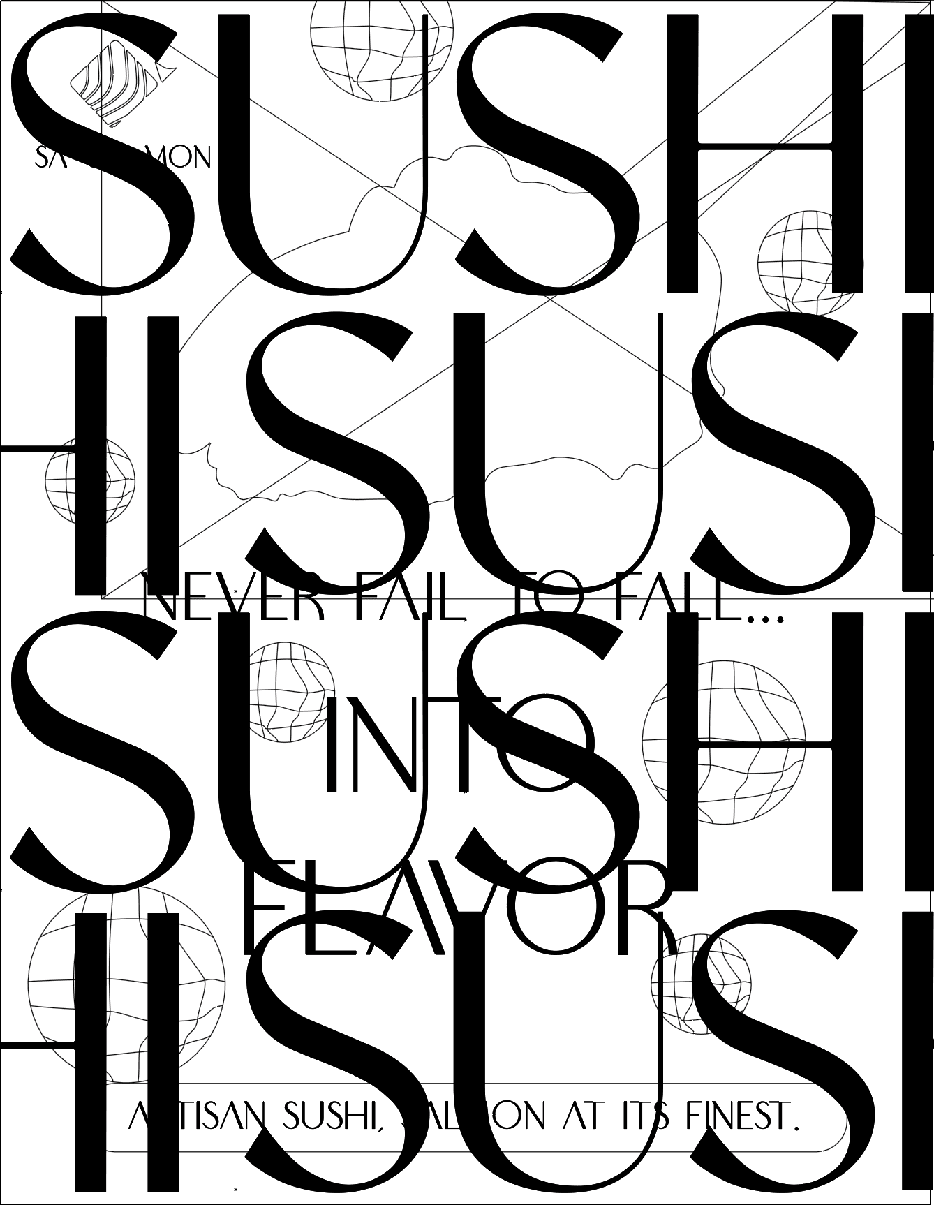
The design uses bold, oversized typography to create a strong visual hierarchy and depth. Repetition of the word “SUSHI” builds rhythm and reinforces brand recognition. High contrast between the dark background and vibrant salmon imagery draws attention to the product. I used a gradient mesh technique to create the salmon roe, adding realistic lighting and dimensional depth. The layered composition and grid alignment create a modern, structured, and premium visual balance.
Design
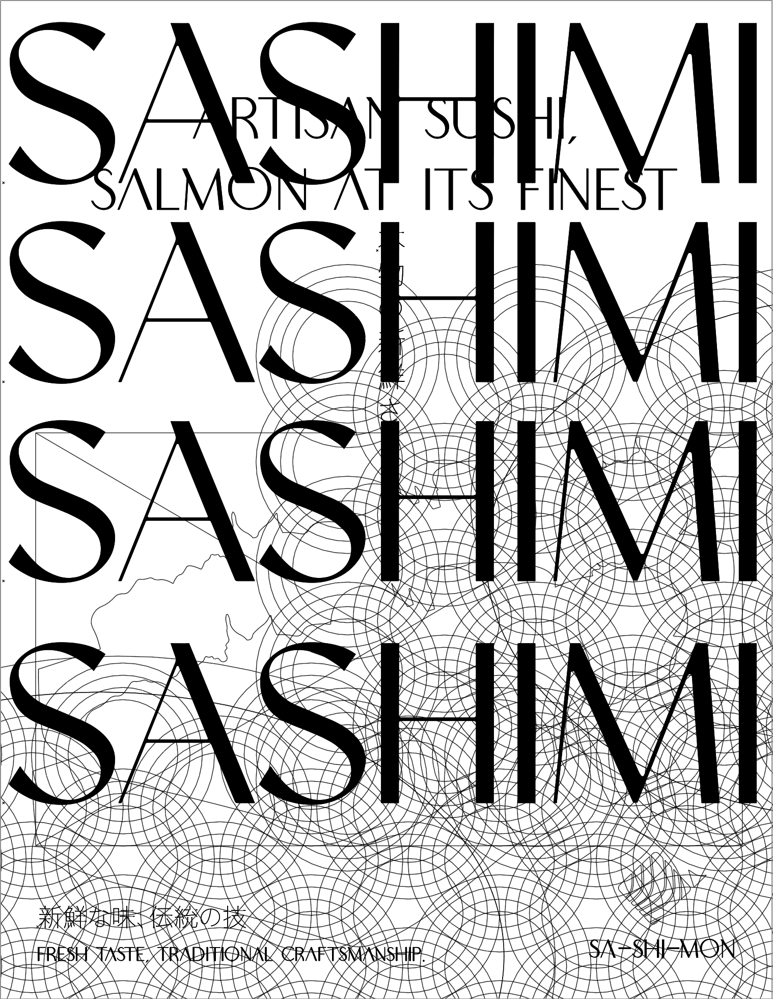
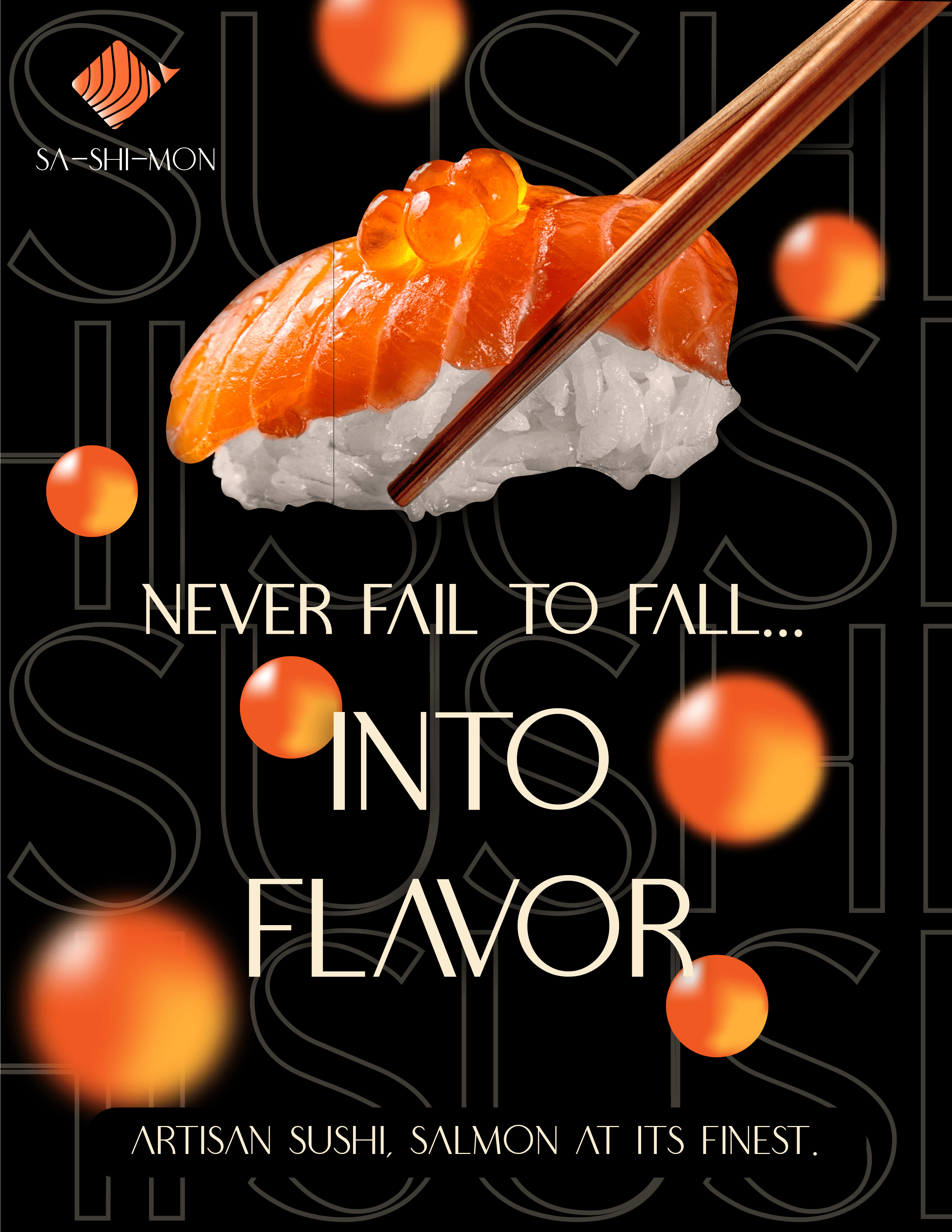
The design uses repeated oversized typography to create rhythm, depth, and a strong visual hierarchy. The repetition of “SASHIMI” reinforces brand identity while guiding the viewer’s eye through the layout. High contrast between the dark background and vibrant food imagery highlights freshness and quality.
The Japanese text 「本物の新鮮さ」 (real freshness) and 「新鮮な味、伝統の技」 (fresh taste, traditional craftsmanship) reinforce authenticity and cultural context. Curved graphic elements and subtle Japanese patterns add depth, while the structured grid and layered composition maintain a clean, modern, and premium aesthetic.
Challenge & What I learned
One of the main challenges was balancing oversized typography with product visibility without overwhelming the composition. I had to carefully adjust hierarchy, contrast, and spacing to maintain readability while keeping the design bold. Another challenge was integrating traditional Japanese elements in a modern way without making it feel cliché.
Through this process, I learned how to control visual hierarchy more intentionally, use contrast strategically to guide attention, and refine layered compositions to achieve a premium, cohesive aesthetic.
This will hide itself!